The main goals of Loop, EE's Design System are to:
scale the design system
increase user adoption and engagement
increase visual consistency and quality of designers output
improve efficiency for designers
reduce time to ship products for EE squads
to become a single source-of-truth for the EE brand
To achieve this I:
set out a strategy for prioritising our backlog
facilitated research sessions and workshops to understand our users, increase design system awareness and promote collaboration
created video tutorials on how users can make the most out of components
held training session to build user confidence
devised a contribution model to reduce component build time
implemented a plan for reducing the complexity and maintenance of our existing components
created guidelines and standards
Prioritising our backlog
Ensuring we work on the right thing
The challenge
We needed to set out a strategy for prioritising our backlog of components and patterns to:
improve transparency with our users and leadership team on when things would be delivered
improve the cadence and consistency of our releases
Discovery
I started by outlining the metrics that would establish an order to approach the backlog:
complexity
commonality
business priority (how many squads needed the component)
considerations for design and development across web and app
other foundations or components needed to build this one (atomic approach)
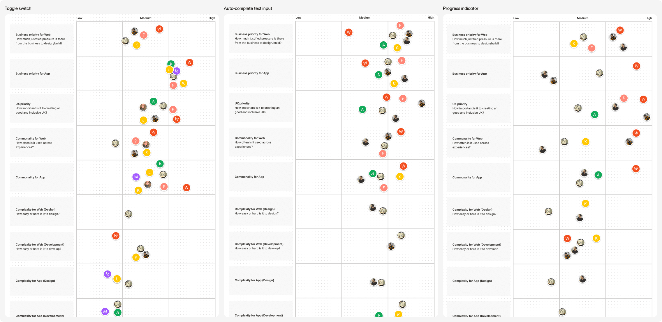
I facilitated four workshops with the design system squad, with representatives from each discipline rating each metric for each component on a priority scale. Ratings that varied significantly were discussed to come to a consensus.
Synthesising the data
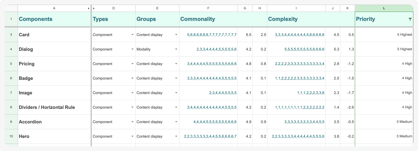
I created a spreadsheet to synthesise this data, applying a weighting (priority of metrics) to the median values of votes, and then using a formula to assign a priority from one to five (lowest to highest).
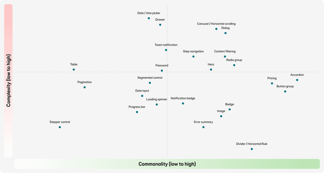
A graph helped the team to visualise and compare complexity to commonality.
We then analysed this data alongside surveys completed by users and analytics from Figma and React on the existing community-owned libraries.
Impact
The prioritisation of our backlog is now informed by research and data, giving the squad, design leadership and users confidence in our roadmap. Our bi-weekly release goals are now value-driven and aligned to the squads needs.
Workshop findings
Spreadsheet ordered by component priority
Comparison of complexity and commonality
Tokens approach
The foundations of all things
Alongside the team, I co-developed our tokens approach by:
studying other design system best practices
reviewing the scope of the design system to ensure scalability
working with the branding team to match design intent
stress testing the coded and design tokens with designers and engineers
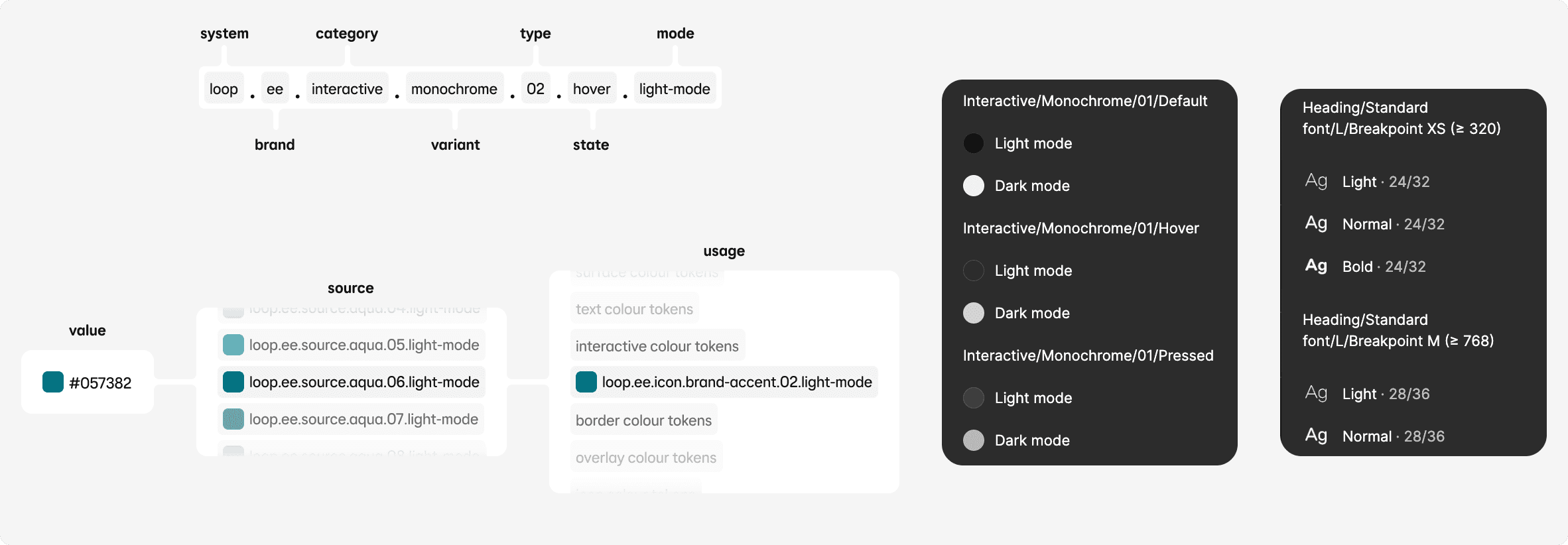
Figma is the source of truth for tokens, which are distributed to React, Flutter and Zeroheight. These include colours, typography (font-family, font-weight and font-size), breakpoints, elevation, icon sizes and padding.
Alongside our existing Figma styles, variables are being introduced to scale the design system further.
Component approach
Building and refactoring components that balance user needs with flexibility, ease of use and maintainability
I defined a series of guidelines and standards for how to build the most effective components, this included:
simplifying component structure and variants to reduce complexity and maintenance
naming conventions for layers and properties guided by user research
how to apply theming to flex the EE brand
how Figma variables can simplify breakpoints and modes
getting the most out of the latest Figma features
quality-of-life improvements (i.e. useful presets and layouts instead of placeholders)
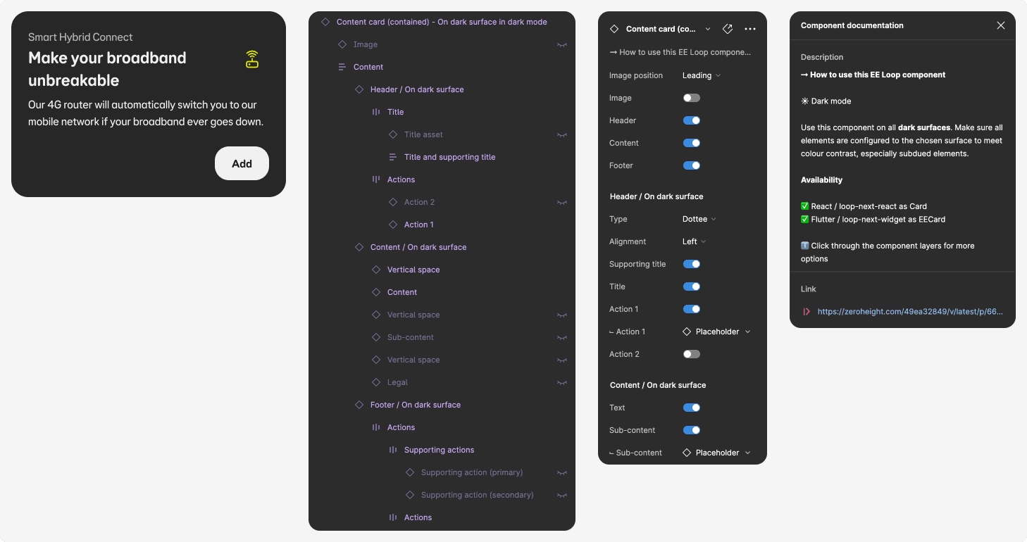
We have over 50 feature-rich components created for web, iOS and Android.
Building a community
Advocacy, knowledge sharing and building confidence
Through advocacy and close collaboration with the journey squads the design system currently has over 650 users, working across 26 teams. Users range from product designers, content designers, researchers, engineers, product owners, design leadership and more.
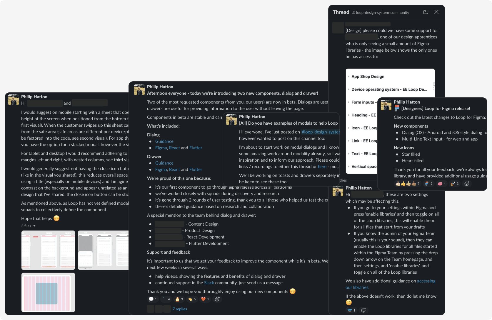
Ensuring users are supported at all stages is key to driving engagement with our design system, and this starts with their very first month at EE. New joiners are welcomed with an interactive Loop onboarding session, followed by Figma training. Our releases are followed by a show-and-tell to drive awareness and excitement, and drop-in clinics to solve challenges.
We've found surveys and feedback are a great way to understand how users are interacting with the design system, their satisfaction, suggested improvements and challenges.
Monthly videos are shared on what's new, component analytics, where we're heading and how users can get involved. This drives engagement with our users and gives leadership a greater understanding of how the design system is improving efficiencies and the time it takes to ship products within the squads and reducing costs.
Figma for designers
Flutter for Android and iOS engineers
React and Storybook for React engineers
Zeroheight for guidance
Slack for communications
Contribution into the design system
Reducing component build time through empowering our users
The challenge
To support our goals of scaling the design system, reducing the time it took squads to ship products and supporting EE’s new vision (rebrand and growth in new markets), I introduced a contribution model for Product Design. This would enable our users to work alongside the design system squad as part of our extended team.
Process
I worked with design leadership and product owners ensures designers and engineers have capacity in their sprints to contribute to the design system.
Designers and engineers are incentivised to contribute by making the adoption of the design system a key objective for squads.
I provided technical training for designers where needed to upskill them in Figma and design system thinking.
Progress
We have on average five components, enhancements or patterns in progress at any one time.
As each contribution sub-team is made up of product designers, content designers, React and Flutter engineers, collaboration is encouraged by:
dedicated Slack channels to discuss ideas and update on progress
regular co-design sessions with the design system squad for guidance and knowledge sharing
Impact
Contribution has re-shaped the design system:
components are built and released 50% quicker
increased user engagement, understanding and sentiment towards the design system
users feel collective ownership for the design system
contributors are sharing greater awareness of WCAG AA and brand guidelines from working on the design system
the design system team have deeper insight into how the squads work
Contribution process
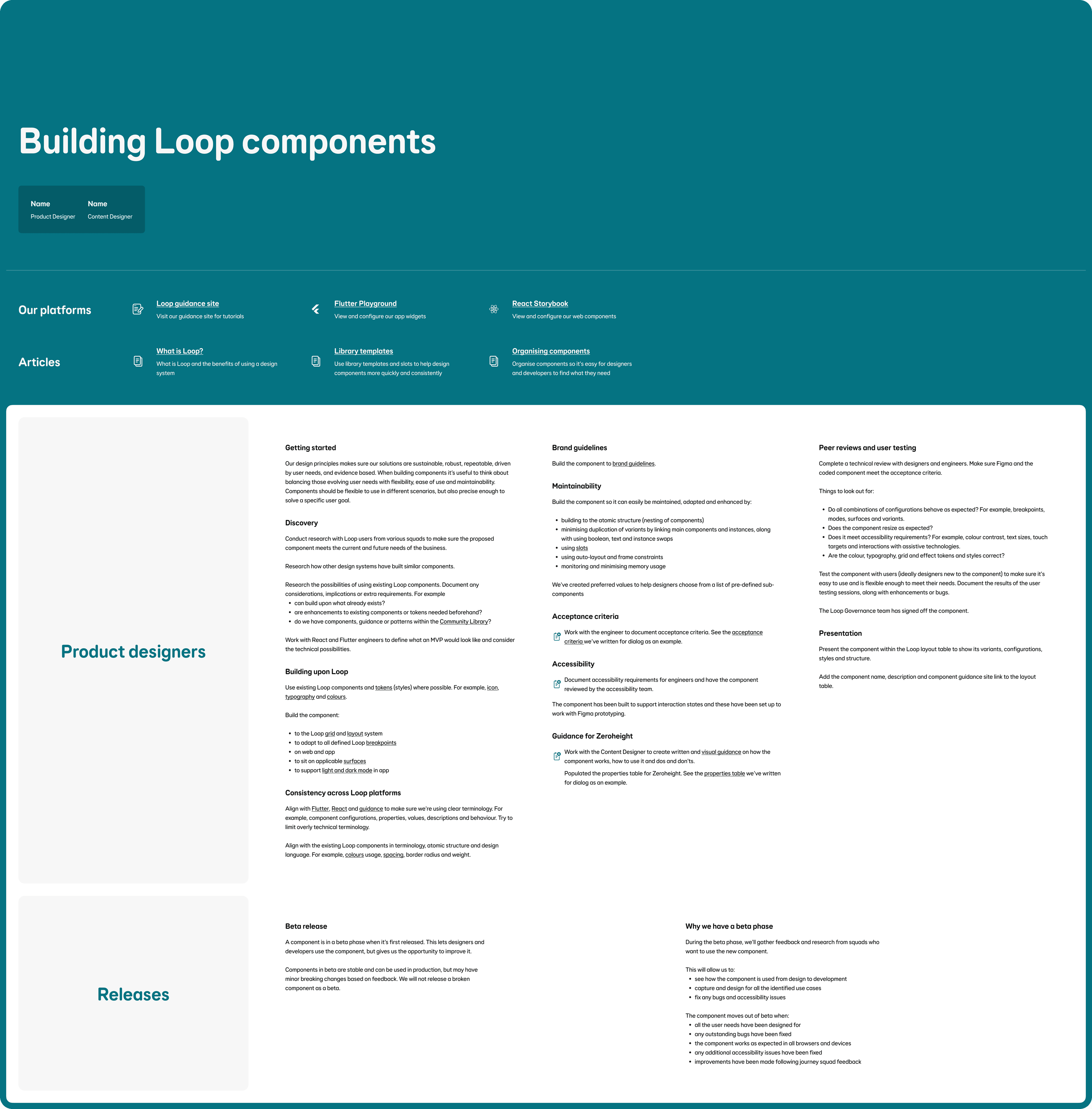
Guidance I created for our contributors on the design system standards and method
Outcomes
How the design system is performing
Through contribution we've increased the number of components and patterns in the design system by 31 (from 19 to 50) and significantly reduced the build time for design and development.
Figma analytics has shown an increase in squads using the Loop design system, alongside a decrease in squads using the BT/EE legacy community libraries - through an effort to consolidate similar components into the design system.
The complexity and 'weight' of components (variants) have reduced, some by 80%, increasing the speed of designers Figma files.
For the last two quarters we've seen a 30% increase in React repositories using the design system.
