Discovery
Researched how other design systems have approached dialogs and drawers, including:
categorisation
naming
scope
structure
configurations
usage
Conducted card sorting exercise with users to understand the most recognisable naming for the component.
Reached out to users to understand challenges with existing custom and community created components and their user-needs for a dialog and drawer.
Outlined technical possibilities with engineers along with defining an MVP to keep each platform aligned to a goal.
Planning how we can build upon what already exists within the design system (components, patterns and tokens) and if any improvements or additions are needed.
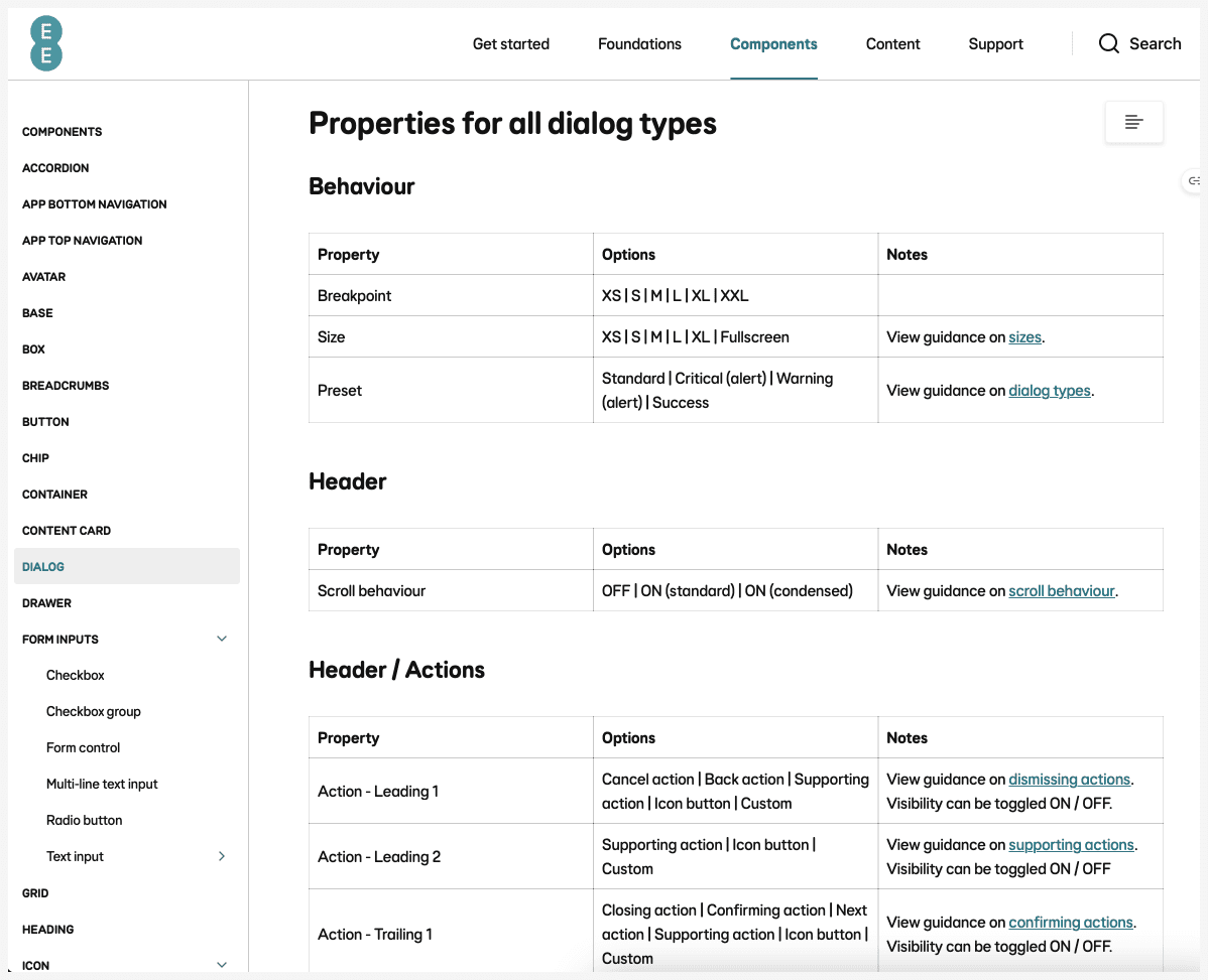
Planning configurations for the component (properties and values) based on our users’ needs.
Structuring component to maximise ease of use, flexibility and maintainability.
Designing prototypes and testing with users to understand if component is meeting their needs.
Designing smaller elements such as presets for icons and actions, progressing to the navigation and header, and then states, breakpoints, surfaces and modes.
Defining acceptance criteria for engineers and QA to ensure alignment and quality.
Facilitating workshops to improve consistency between all our platforms. Setting out universally clear terminology for component configurations, properties, values, descriptions and behaviour.
Aligning with the existing design system components in naming convention, atomic structure and design language to ensure cohesion and familiarity among designers.
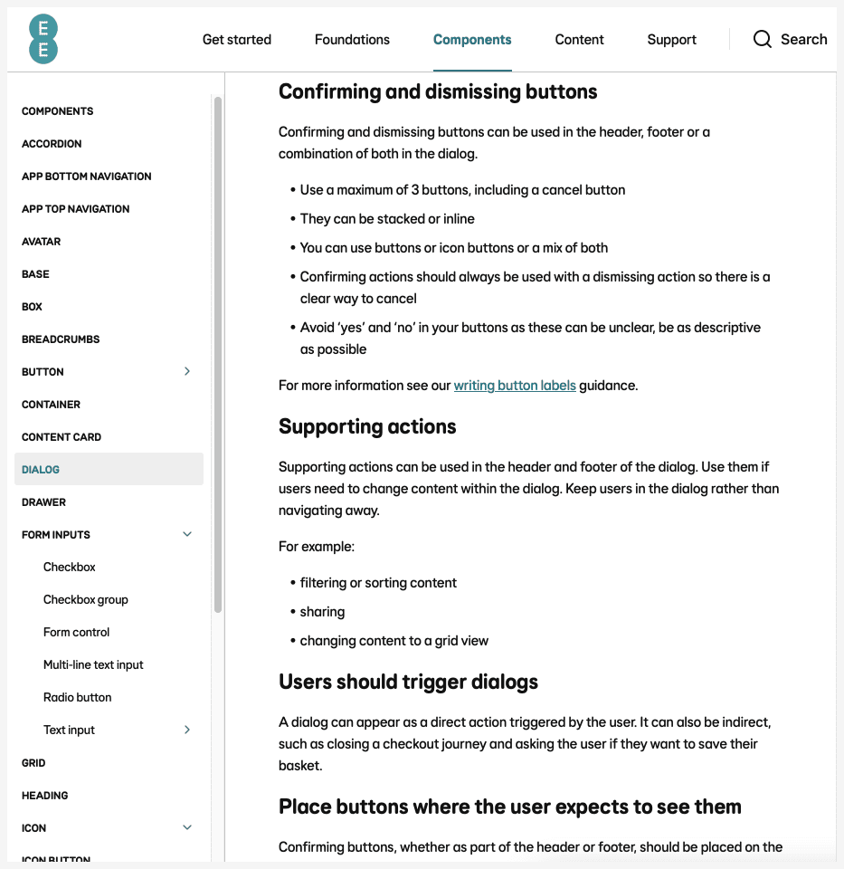
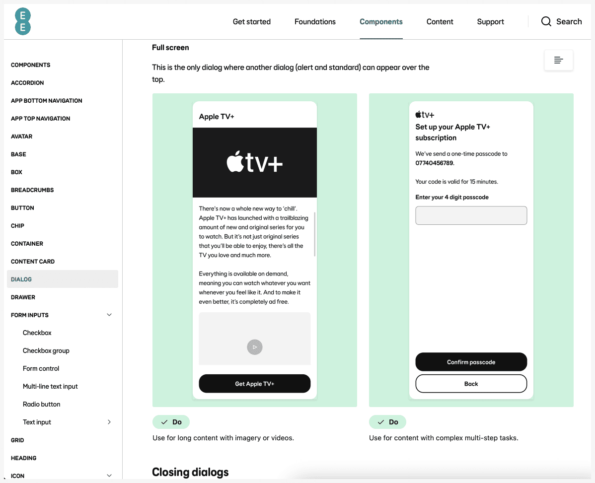
Writing the guidance with support from content designers (how to use, when to use and do's and don'ts).
Reviewing with accessibility team and checking in with engineers throughout.
Facilitating workshops to set out user research plan (questions, hypotheses and tasks).
Gathering the users’ understanding of terminology and if there are more recognisable terms for the behaviours and properties.
Tasking the user to familiarise themselves with the component which encourages natural exploration, then asking them to carry out tasks that target potential challenges identified in the research plan.
Grouping and analysing the research data in workshops, and collaborating with content designers and engineers to plan iterations to the component and guidance.
Highlights from the user research:
Terminology
There wasn't much understanding of 'modality'.
Terms that describe behaviour and form will be used instead of modal/modal-less/non-modal.
Navigating
Most designers showed a preference for configuring the dialog by filtering down through the sections (layers) and only showing the relevant options they wished to change, as opposed to seeing all options together. Whilst this reduces cognitive load, users often missed key options.
Whilst users found the sections of the component (title, content and navigation area) useful, they struggled to understand which layer showed which property (in the configuration panel).
Layers have been renamed and simplified to give clearer atomic structure and an indication as to what properties to expect.
Properties
Designers struggled to understand what the component properties (configurations) did, thought they were highly technical and long, causing truncation and difficulty scanning. Users toggled properties on/off to see what they did.
Labels have been reduced and naming convention reordered and simplified, showing first what users expect to see, followed by position and usage (i.e. icon button - leading - confirming action).
Complexity
There was a general sense that the component was overwhelming to start building from.
Commonly used presets (pre-build variations of the component) have been added so that designers have a starting point. Short video tutorials have been created.
The dialog and drawer components are now used by 23 squads. An estimated 40% reduction in design time compared to using custom components.
Feedback has been positive: “Loving the component, it literally has all the options we need and it’s easy to use, thank you!”
Dialog and drawer flexibility
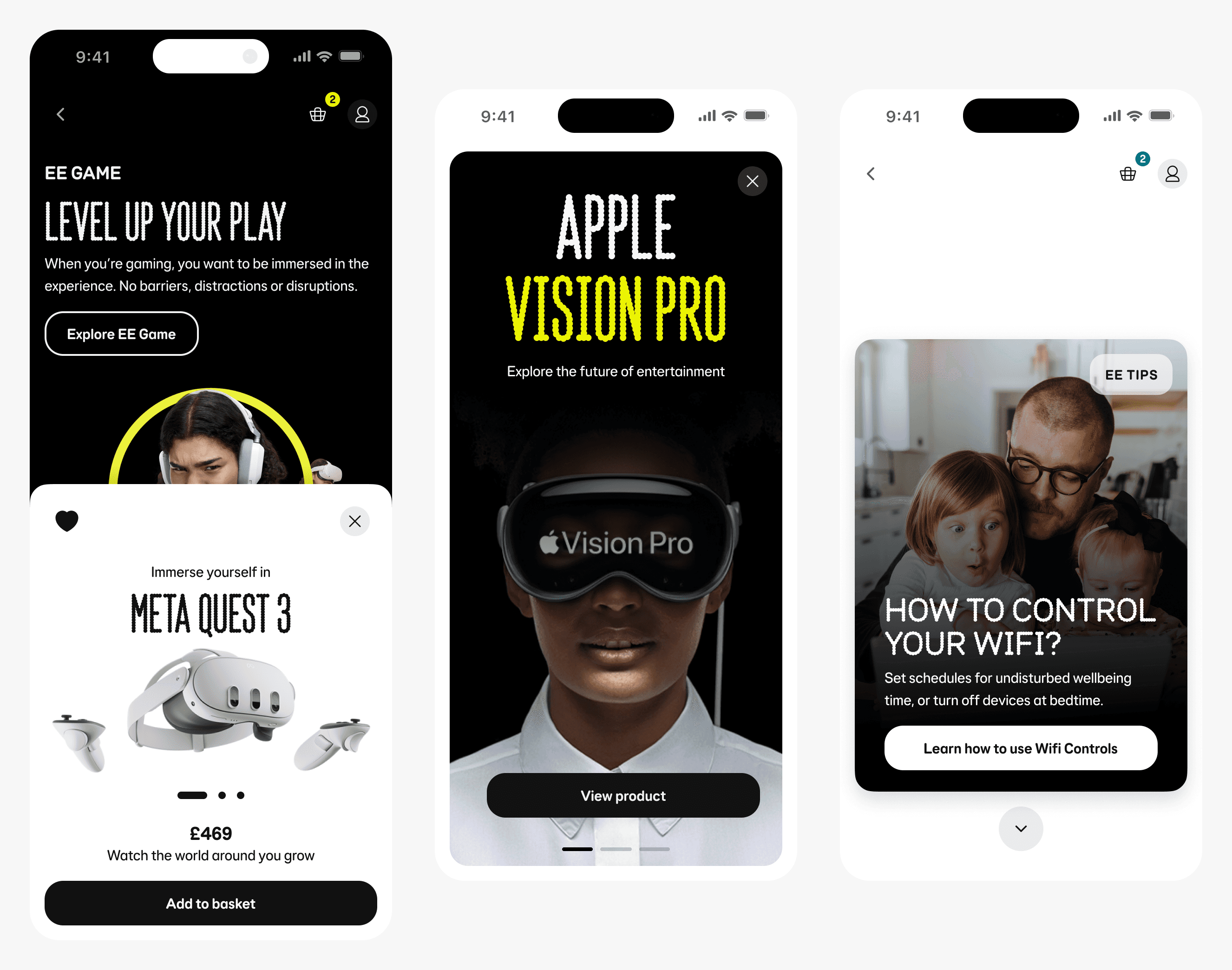
Dialog and drawer component foundations

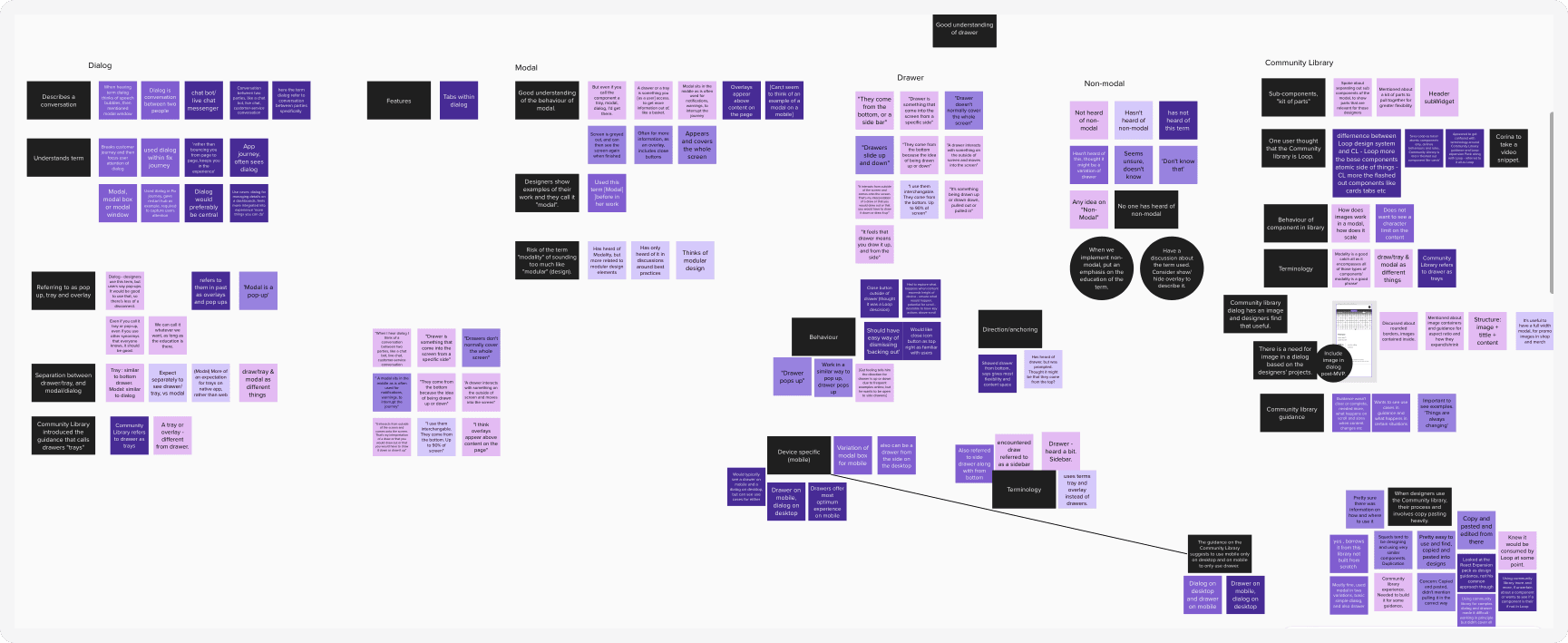
User research sessions - To understand terminology, usage and behaviour

User research analysis - To understand terminology, usage and behaviour
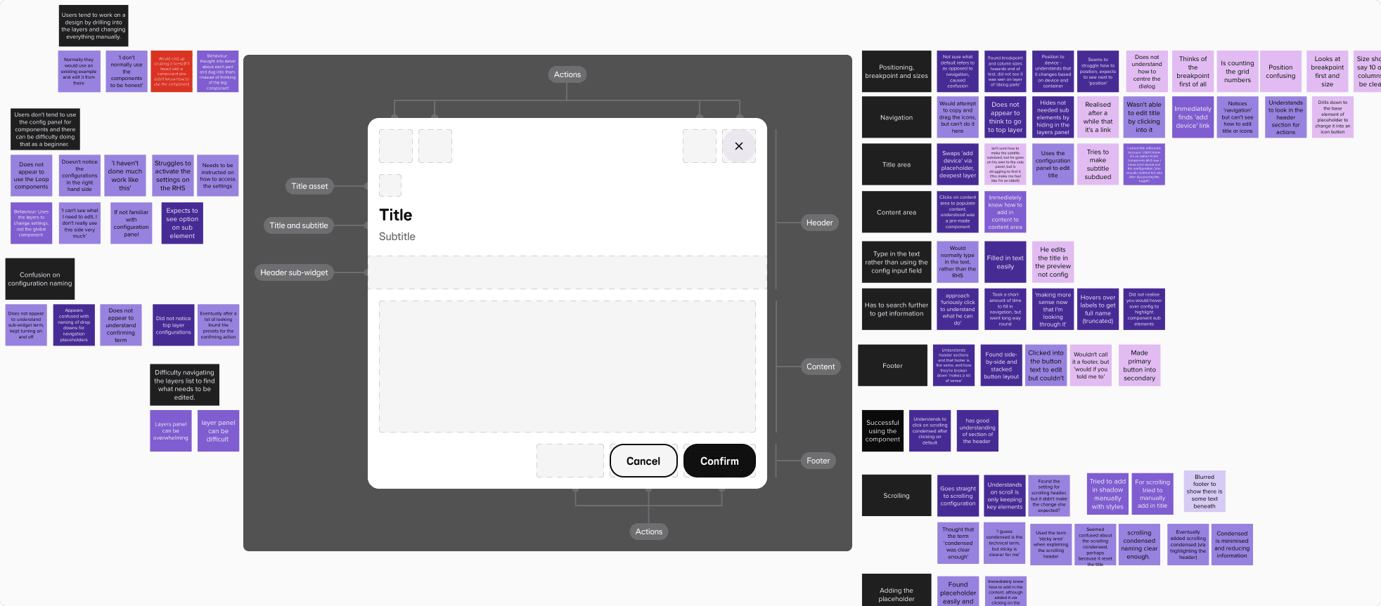
User research analysis - Designers building a dialog component
Examples of guidance for users
